Product Gallery Slider replaces WooCommerce’s product image gallery with a slider, grid or stacked layout, with thumbnails, hover zoom, a lightbox, video slides and each variation’s own images, on classic and block themes.
Requirements
- WordPress 6.8 or newer
- WooCommerce 11.1 or newer
- PHP 7.4 or newer
- Works with classic and block themes, WooCommerce’s Product Image Gallery and Product Gallery blocks, Elementor, Elementor Pro, Divi 4, WPML and Polylang, multisite, and our Product Video Gallery.
- In Bricks templates, use the shortcode.
Installation
- Download
product-gallery-slider.zipfrom My account > Downloads. - In WordPress, go to Plugins > Add New Plugin > Upload Plugin, choose the zip file and click Install Now.
- Click Activate. Everything is under Product Gallery in the admin menu: Layouts, Display rules, Settings and Tools. Each product has a Gallery tab in Product data, and each image has Video link and Video file fields in the media window.
Quick start
- Activate the plugin. Product pages show the new gallery right away, with the Default layout: a slider with thumbnails below, hover zoom and a lightbox.
- Go to Product Gallery > Layouts and click Edit next to Default. Click a preset or change the options, check the Live preview at Desktop, Tablet and Phone width, and click Save layout.
- To add a video, edit a product, click Add product gallery images and select the image the video belongs to. Paste a YouTube, Vimeo or Dailymotion link in Video link, or click Choose video to pick a video file, then click outside the field to save it.
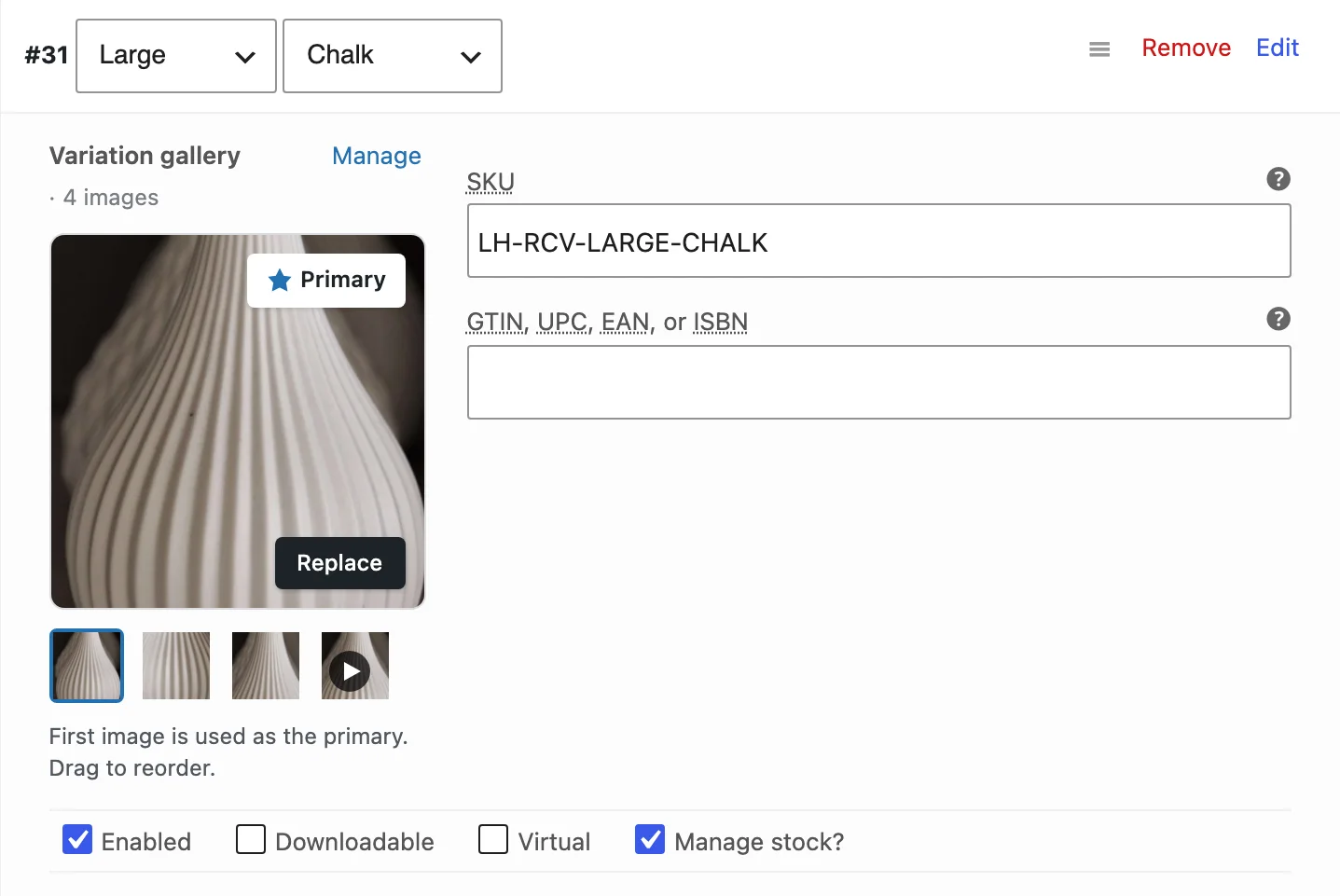
- For variation images, open a variation in Product data and click Add variation images. Choose what a variation pick does in Product Gallery > Settings > Variation images.
- Open the product in your store, pick a variation and play the video.
Layouts
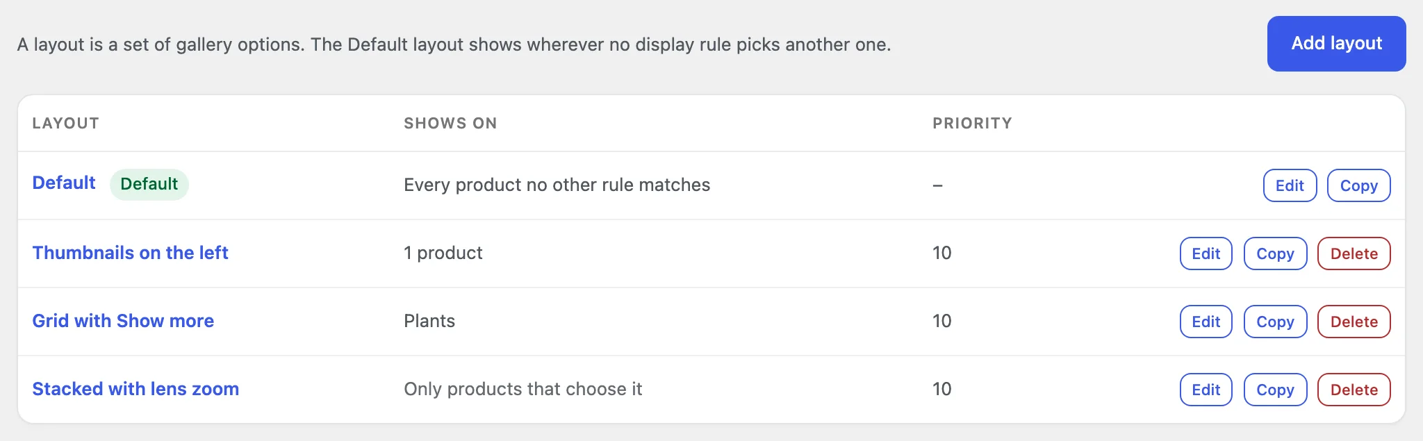
A layout is a set of gallery options. The Default layout shows on every product that no display rule or product choice gives another layout, and it can’t be deleted. Add layout makes a new one, Copy duplicates a layout without its display rules, and Delete sends its products back to the display rules. A store can have up to 100 layouts.
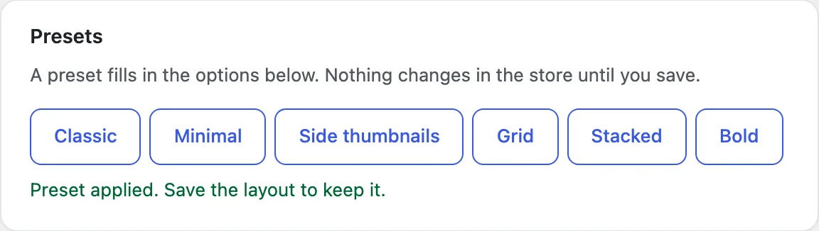
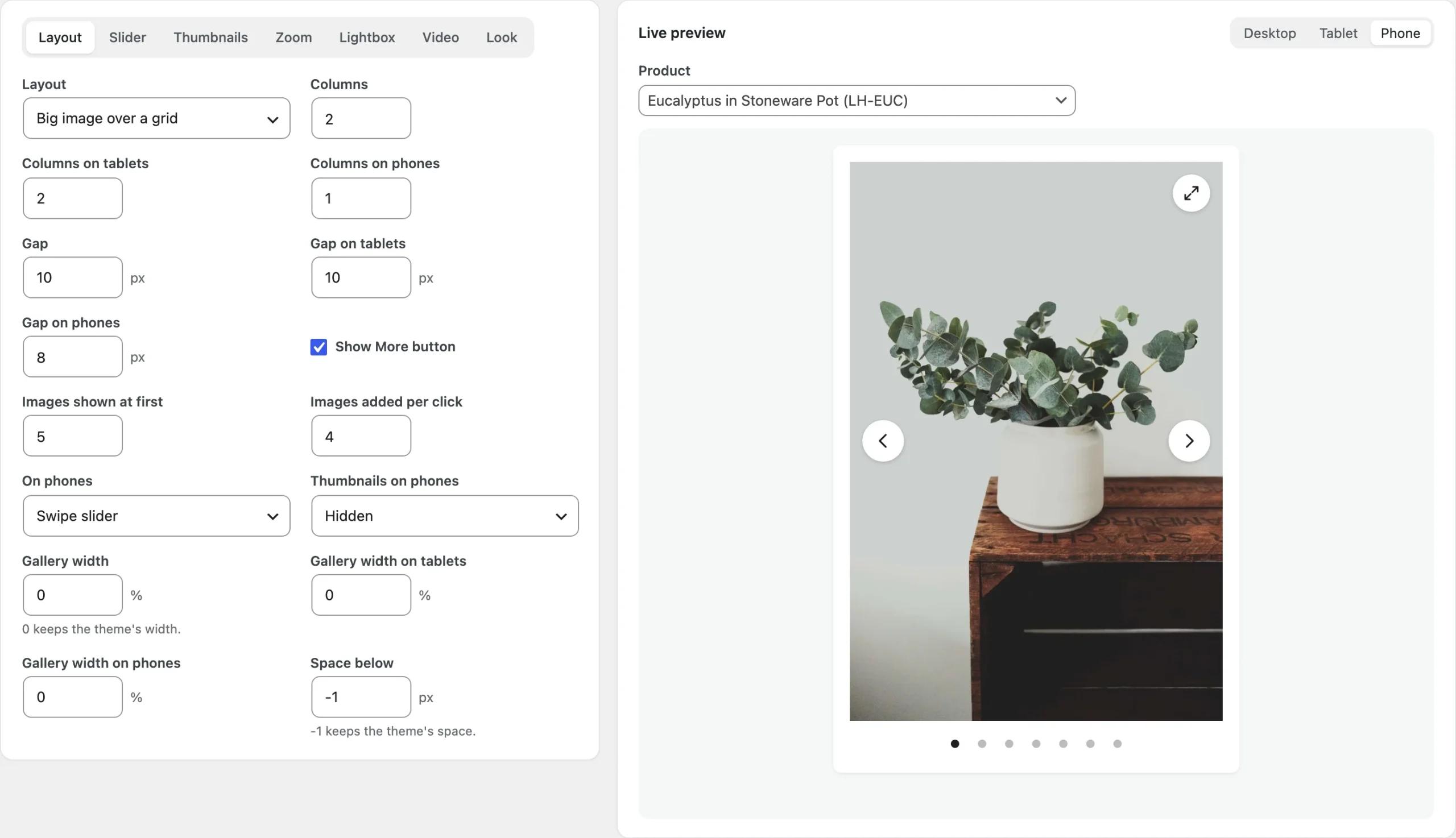
The layout editor has the options in seven tabs: Layout, Slider, Thumbnails, Zoom, Lightbox, Video and Look. Next to them, the Live preview shows the real gallery of a product you pick, at Desktop, Tablet or Phone width, and updates as you change an option. It starts with the product you picked last, or a recent product with three or more images. Presets fill in the options in one click: Classic, Minimal, Side thumbnails, Grid, Stacked and Bold. Nothing changes in the store until you click Save layout.
Layout options
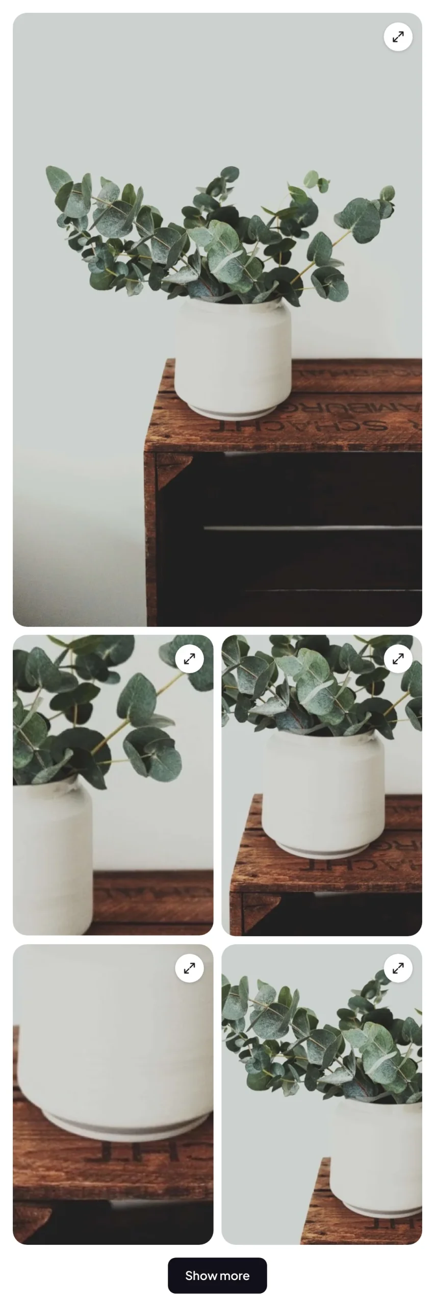
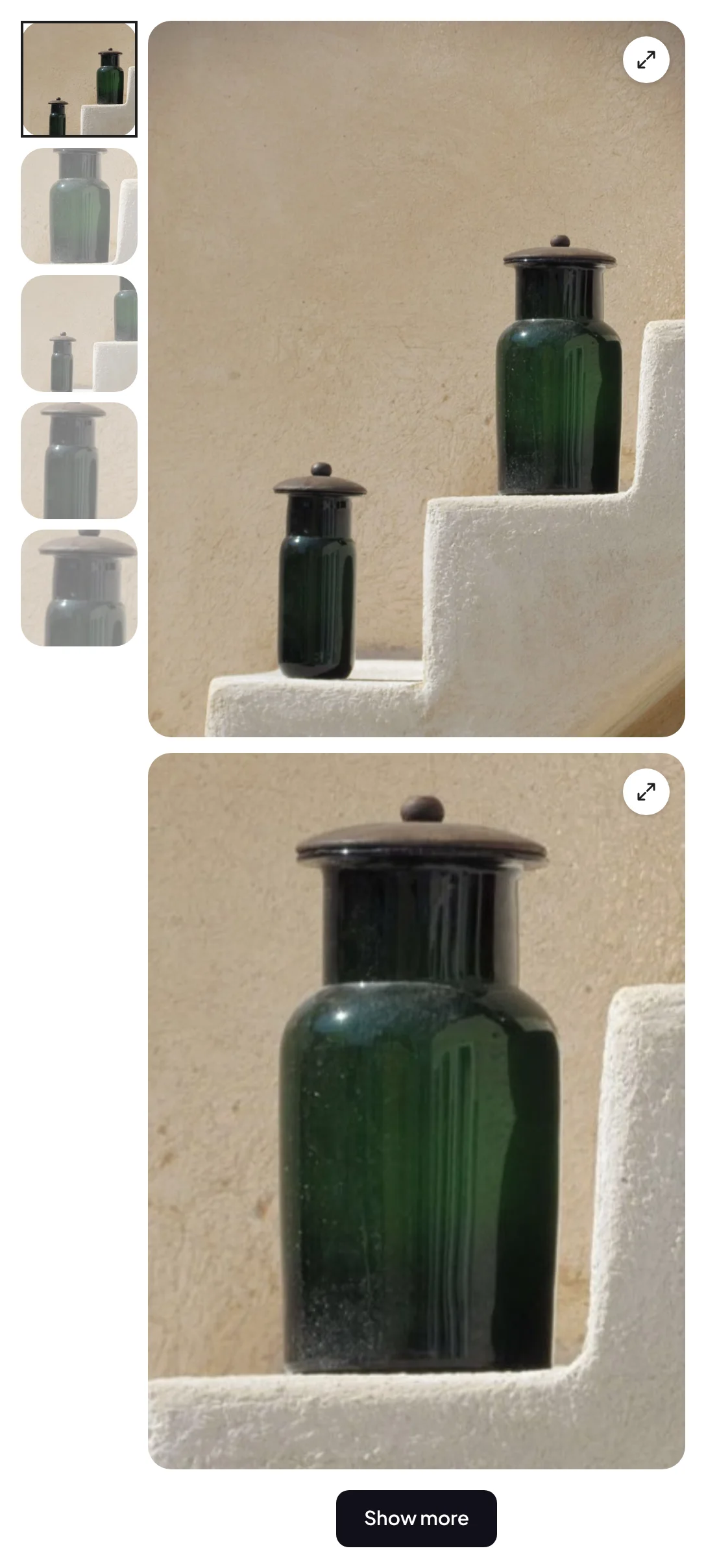
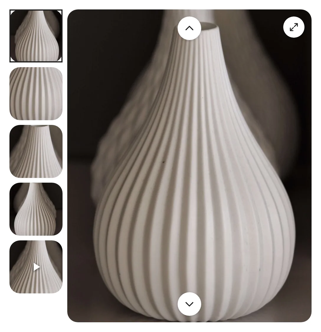
Layout chooses Slider, Grid, Big image over a grid or Stacked. Thumbnails puts the thumbnail strip Below, Above, Left or Right of the slider, or leaves it out with None; the stacked layout uses a strip on the left or right that marks the image in view. Grids have Columns and a Gap for desktops, tablets and phones, and stacked images have a gap too.
Show More button shows the first images of a grid or a stack (4 by default) and adds more with each click (4 by default); its text is in Settings > General. On phones and Thumbnails on phones set the phone layout (see Phones and tablets below). Gallery width for each device (0 keeps the theme’s width) and Space below (-1 keeps the theme’s space) fit the gallery to the theme’s image column.
Slider
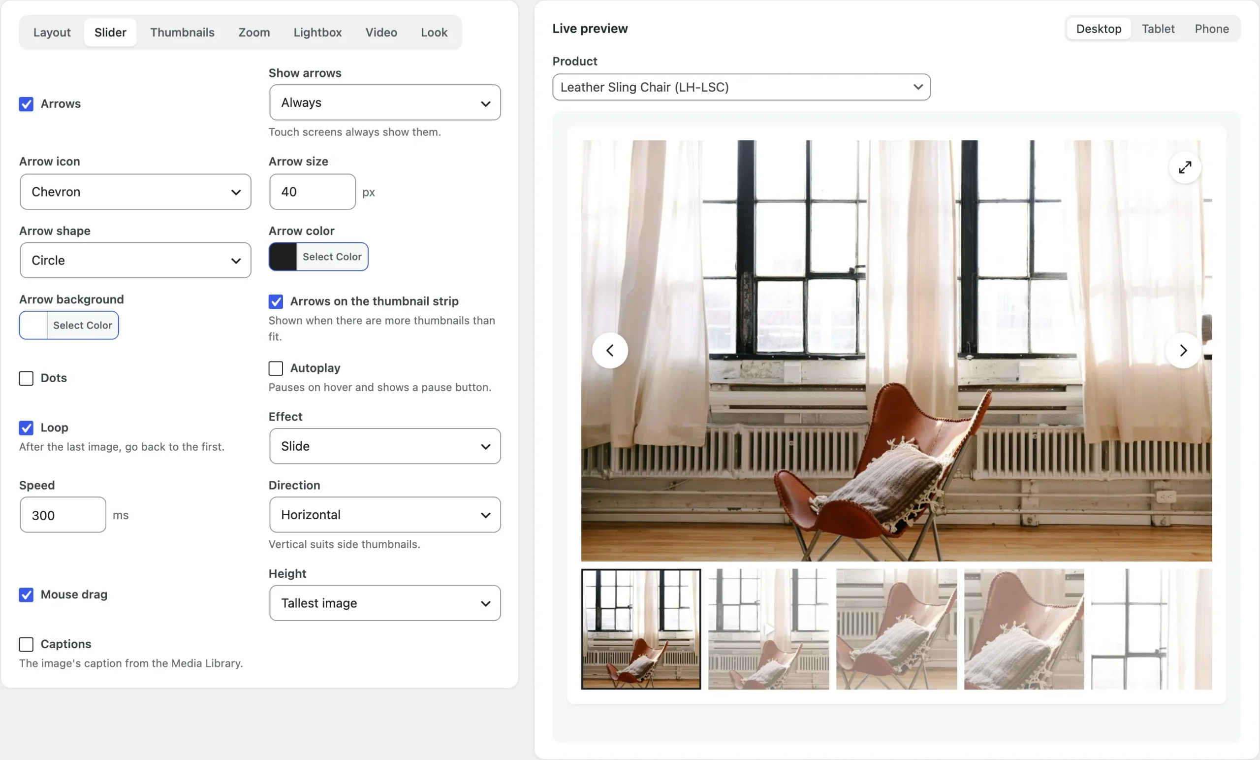
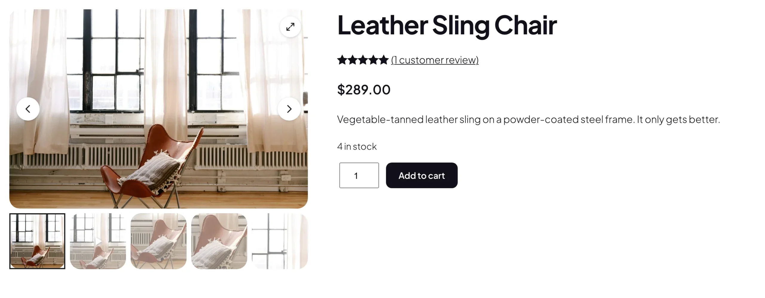
Arrows can show Always or On hover (touch screens always show them), with four icons (Chevron, Arrow, Caret and Thin angle), a size, four shapes (Circle, Rounded, Square and Icon only) and their colors. Arrows on the thumbnail strip show when there are more thumbnails than fit. Dots can be dots, lines, numbers, a counter such as 2 / 5 or a progress bar, on the image or below it.
Autoplay moves to the next image after a delay, pauses on hover and shows a pause button. Loop goes back to the first image after the last, Effect slides or fades at the Speed you set, Direction can be vertical, which suits side thumbnails, and Mouse drag lets mouse users drag like a swipe. Height adapts to each image, uses the tallest image (the default, so nothing below the gallery moves between slides) or a fixed shape such as 1:1 or 4:5, with the whole image or filled and cropped. Captions shows each image’s caption from the Media Library.
Shoppers can also move through the images with the arrow keys, Home and End. For shoppers whose device asks for less motion, autoplay starts paused and slides change without animation.
Thumbnails and look
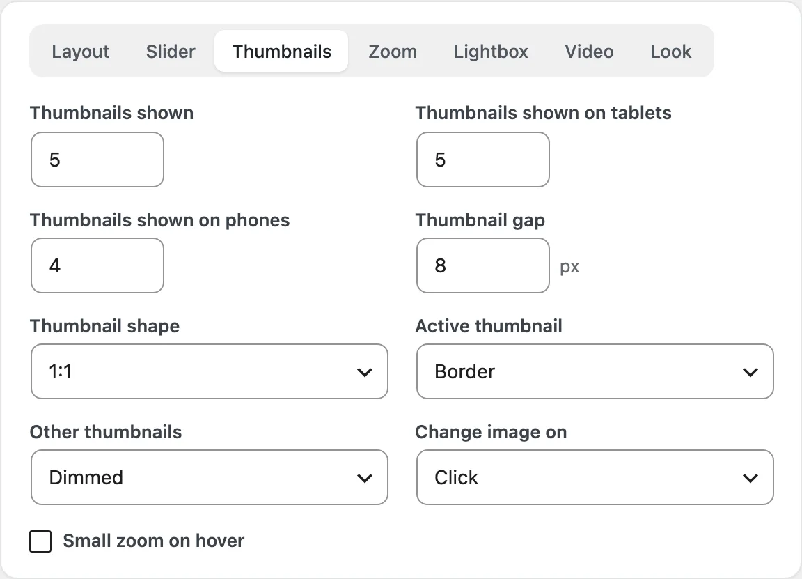
Thumbnails shown sets how many fit in the strip on desktops (5), tablets (5) and phones (4). Set the Thumbnail gap, the Side strip width for thumbnails on the left or right, and the Thumbnail shape: 1:1, 4:5, 3:4 or the original shape. Active thumbnail marks the current image with a border, an underline, a shadow or a larger thumbnail, and Other thumbnails stay as they are, dimmed or gray. Change image on switches the image on click or on hover, and Small zoom on hover enlarges a thumbnail slightly under the mouse.
The Look tab sets the Corner radius of the images and the Thumbnail corner radius, the Accent color of the active thumbnail, the dots and the progress bar, and a Soft placeholder while images load (on by default) in a color you choose. Settings > Custom CSS adds your own CSS after the gallery styles.
Hover zoom
Hover zoom works on screens with a mouse; on touch screens a tap opens the lightbox. Zoom style zooms Inside the image, in a Side window next to the gallery or through a Lens, at a Zoom level from 125% to 500% (200% by default). The lens has a shape and a size, the side window a width (0 matches the image) and a gap, and Image while zooming can dim or blur the image while the side window is open. The full-size image loads on the first hover.
Zoom on phones is off by default. To turn zoom off for some products, add their categories to Categories without hover zoom in Settings > General, or set Hover zoom to Off in a product’s Gallery tab.
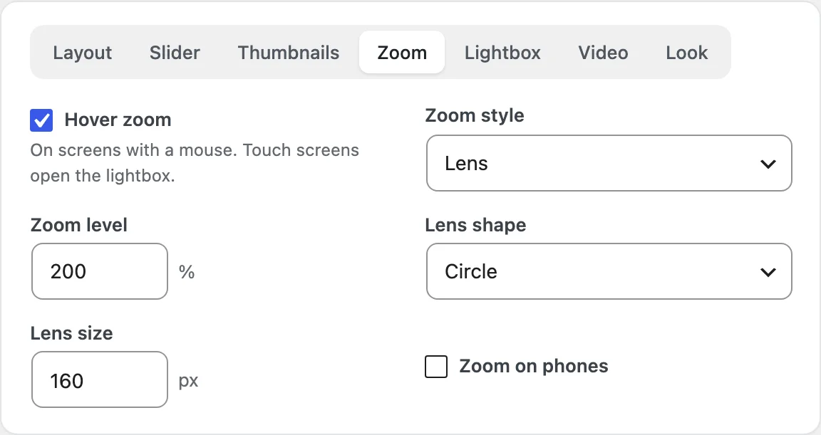
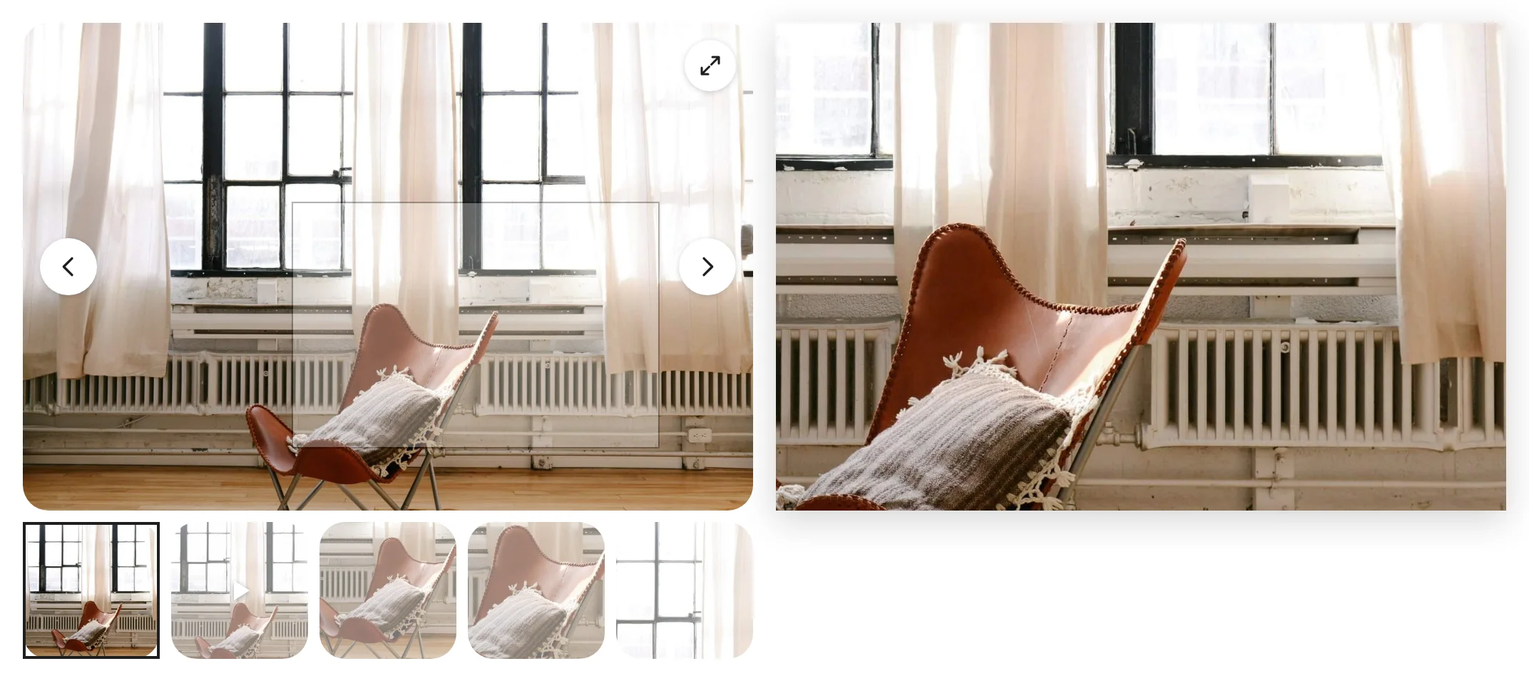
The side window needs room next to the gallery; without it, the zoom shows inside the image. Video slides and images no larger than they’re shown don’t zoom.
Lightbox
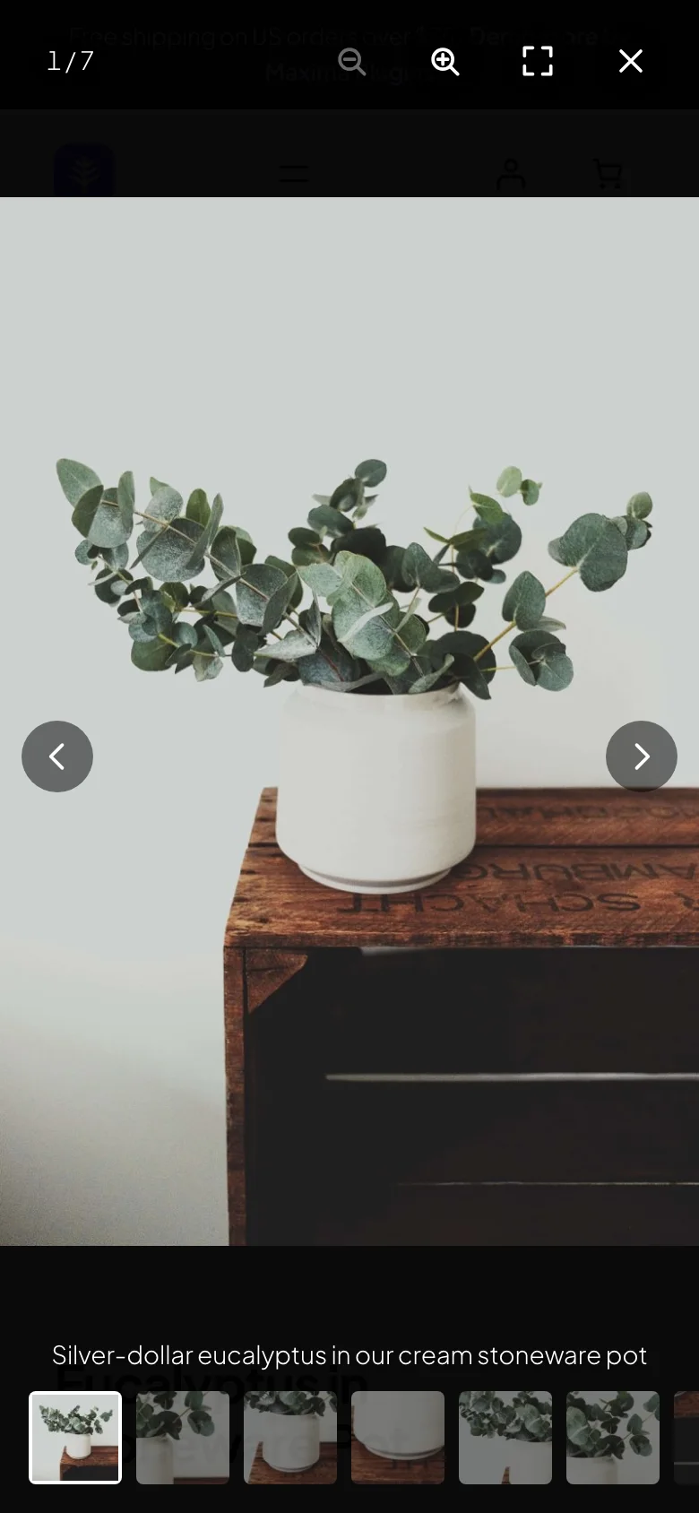
Lightbox opens full-size images over the page from The image and the icon, only the image or only the icon. The icon can be Expand, Magnifier, Plus or Corners, with a size, colors, a corner of the image and an option to show it on hover only. Turn on or off the Captions, the Counter, the Full screen button, Zoom buttons and pinch zoom and the Thumbnail strip, and set the Overlay color, the Overlay opacity (90% by default) and the opening Animation: fade, slide, zoom or none.
In the lightbox, shoppers move with the arrows, the arrow keys or a swipe, zoom with the buttons, a double-click, a double-tap or two fingers, and close it with Escape or by swiping down. Full-size images load only when the lightbox opens. A product’s Gallery tab can turn the lightbox on or off for that product.
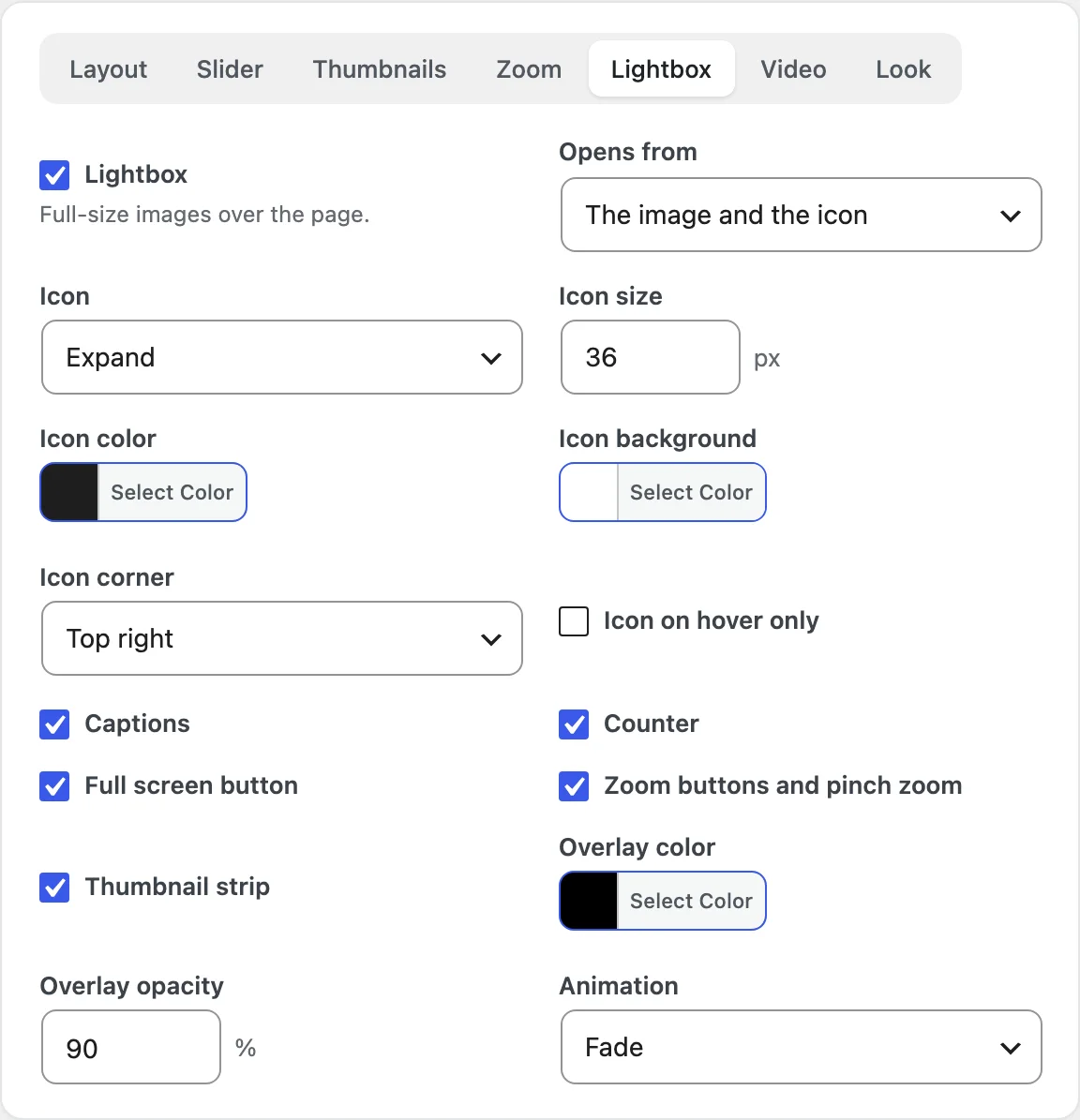
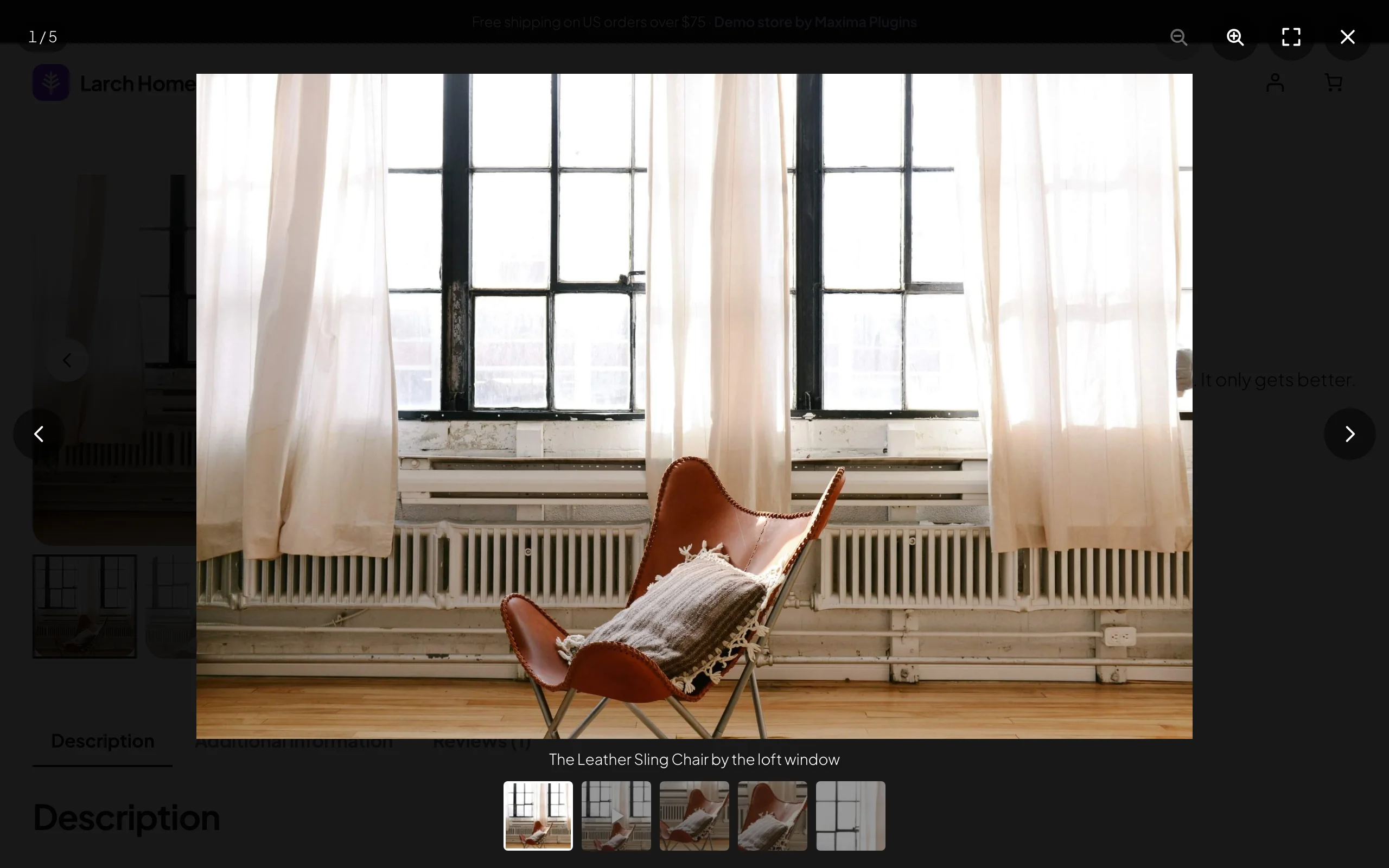
Browsers without full screen support, such as Safari on iPhone, don’t show the full screen button.
Adding videos
A video belongs to an image of the product: the image becomes the video’s cover, with a play button on the slide and a play badge on its thumbnail. Edit the product, click Add product gallery images and select the image. In its details, paste a link in Video link, or click Choose video under Video file to pick a video from the Media Library, which is used instead of the link. The line under the link says which source it found, such as Video: YouTube. It plays on this image in the gallery.
The fields save when you click outside them, so for an image that’s already in the gallery, close the window without clicking Add to gallery. The same fields are in Media > Library for any image, the product image included, and an image used on two products shows its video on both. Images with a video get a play badge in the Product gallery box and in variation galleries.
Links can be YouTube (watch, youtu.be, Shorts, live and embed links), Vimeo (unlisted videos too), Dailymotion, or a direct link to an MP4, M4V, WebM, MOV or OGV file. A start time in the link, such as t=90 or t=1m30s, is kept.
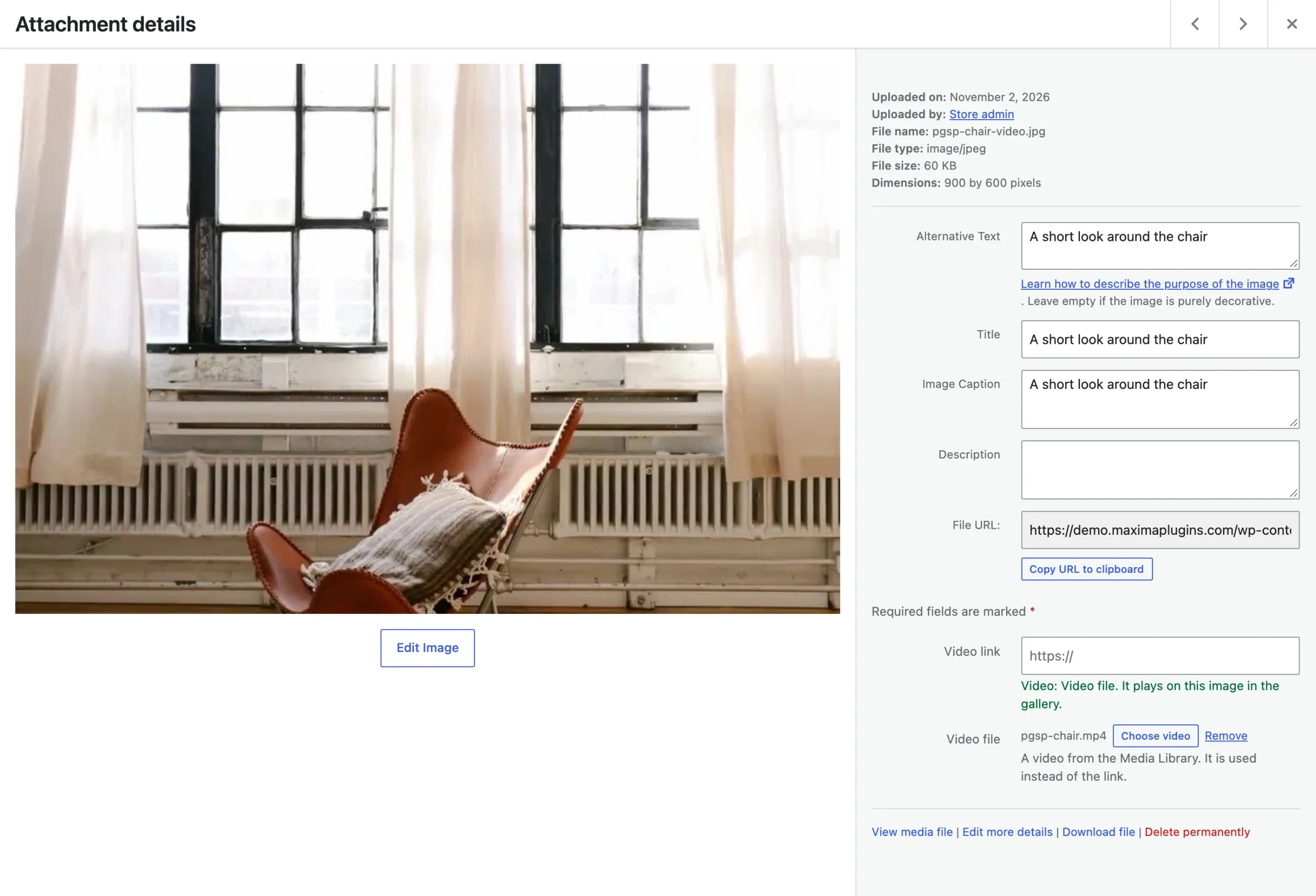
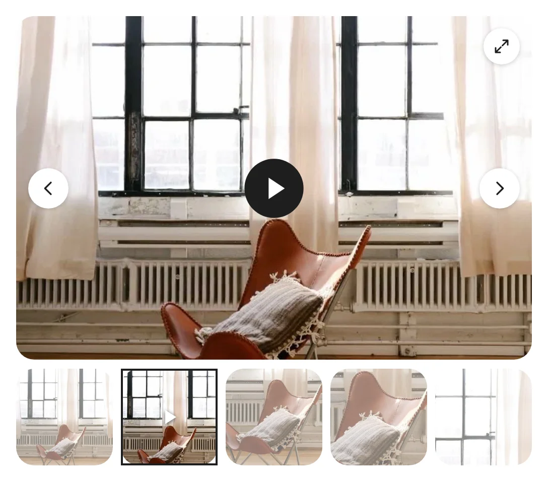
If Video link and Video file don’t show right after you upload a new image, select the image again.
Video options and privacy
The Video tab of a layout sets how videos play. Play videos plays them In the slide or In the lightbox, and Video position keeps each video Where its image is or moves the videos first or last. Play muted when the slide is shown starts a video as soon as its slide shows. Loop videos and Player controls set the player, and the Play icon can be a circle, a triangle, a ring, a rounded box or your own image, with a size and colors.
Nothing loads from YouTube, Vimeo or Dailymotion until a shopper presses play; with Play muted when the slide is shown on, the player loads when its slide shows. YouTube videos play through youtube-nocookie.com and Vimeo videos with Do Not Track, and video files also load only on play. Leaving a slide stops its video. The plugin adds suggested text for your privacy policy to the policy guide in WordPress’s Settings > Privacy.
With our Product Video Gallery plugin active and showing videos on product pages, its product videos show as slides in this gallery, placed by its own position setting, and a variation’s video shows first when the variation is picked. Its player settings apply to its videos, plays still count when it counts plays, and products that already get its shop-card button don’t get a second one from this plugin.
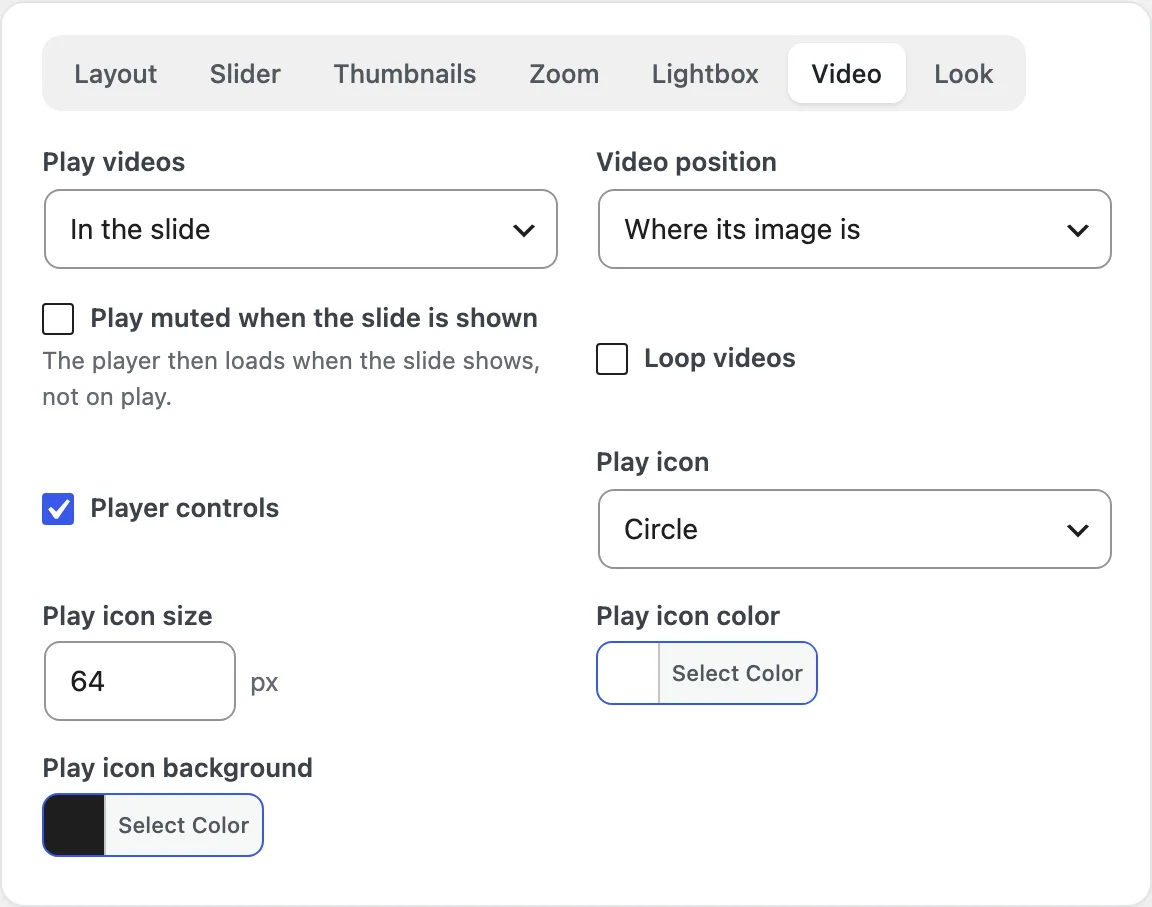
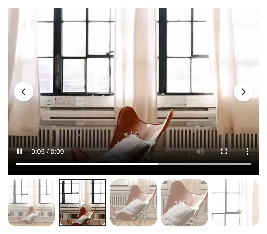
Videos added with WooCommerce’s experimental gallery videos feature don’t show in this gallery; Product Gallery shows a notice while that feature is on.
Variation images
Variation images come from WooCommerce’s own variation gallery: open a variation in Product data and click Add variation images. When a shopper picks a variation, Settings > Variation images > When a variation is chosen decides what the gallery does. Show only its images (the default) shows the variation’s images, Show its images first puts them before the product’s, and Slide to its image moves to the variation’s image when the gallery has it, or adds its images in front. A variation with a single image moves to it the same way. Variations without images of their own show the product’s images.
Show shared images before every option is chosen (on by default) shows a set of images as soon as the options picked so far all share it, such as all sizes of Red. Variation images work with the classic variation form and with the Add to Cart with Options block. On products with more variations than WooCommerce puts in the page (30 by default), a variation’s images load when it’s picked.
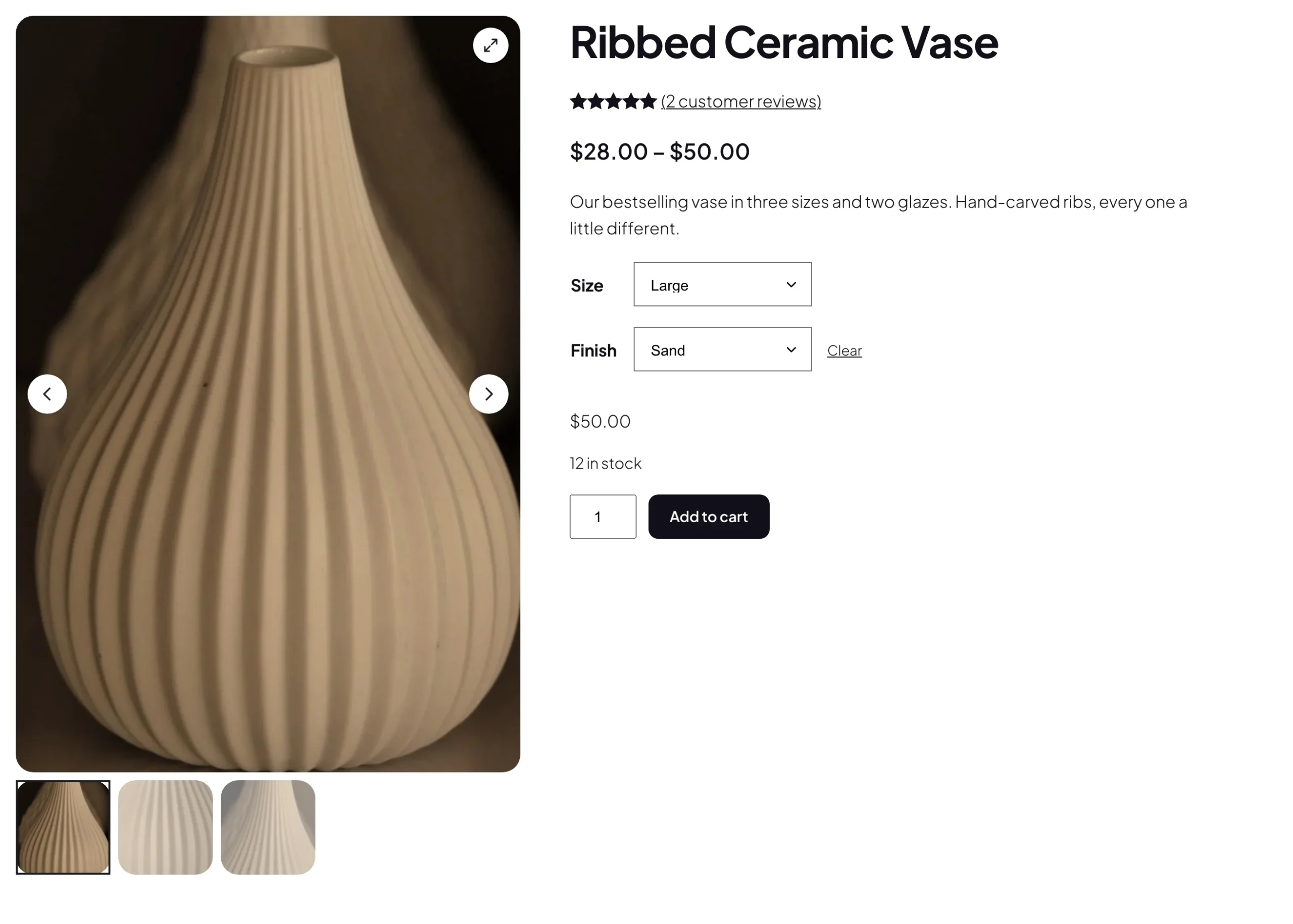
Shared images before the last pick need the classic variation form, or a swatches plugin that keeps its dropdowns, on products with no more variations than WooCommerce puts in the page.
Phones and tablets
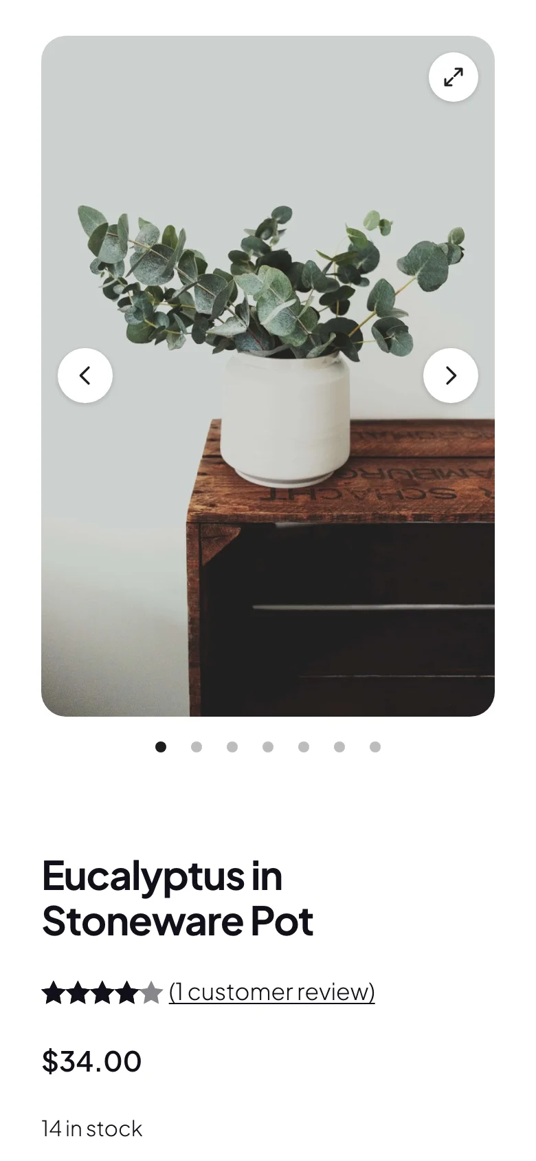
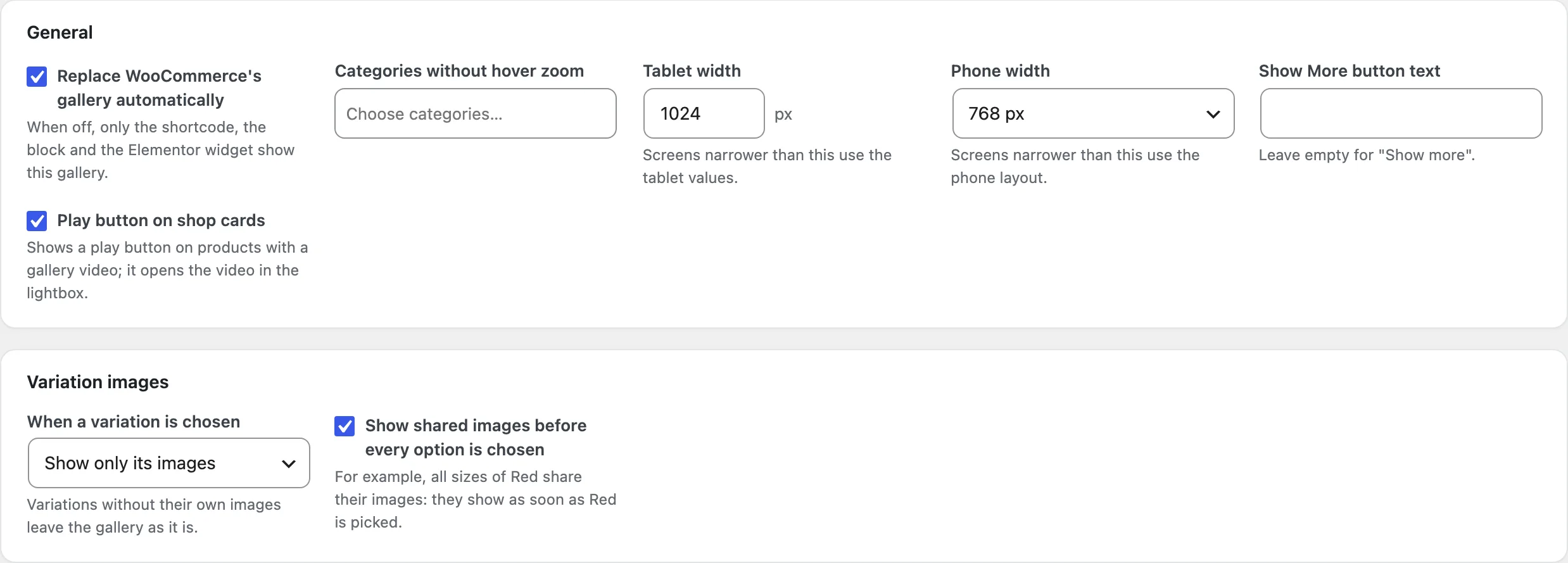
Settings > General sets the Tablet width (1024 px by default) and the Phone width (600, 768 or 1024 px; 768 by default). Below the phone width, a layout’s On phones option turns grids and stacks into a Swipe slider (the default) or keeps the Same layout, and side thumbnails move below the image. Thumbnails on phones shows them Below or keeps them Hidden. Columns, gaps, gallery widths and thumbnails shown each have a tablet and a phone value, and the preview’s Phone button shows the result.
On phones, shoppers swipe between images, and a tap on the image opens the lightbox, where they swipe, pinch to zoom and swipe down to close it. Hover zoom needs a mouse; Zoom on phones (off by default) also allows it below the phone width.
Display rules and the Gallery tab
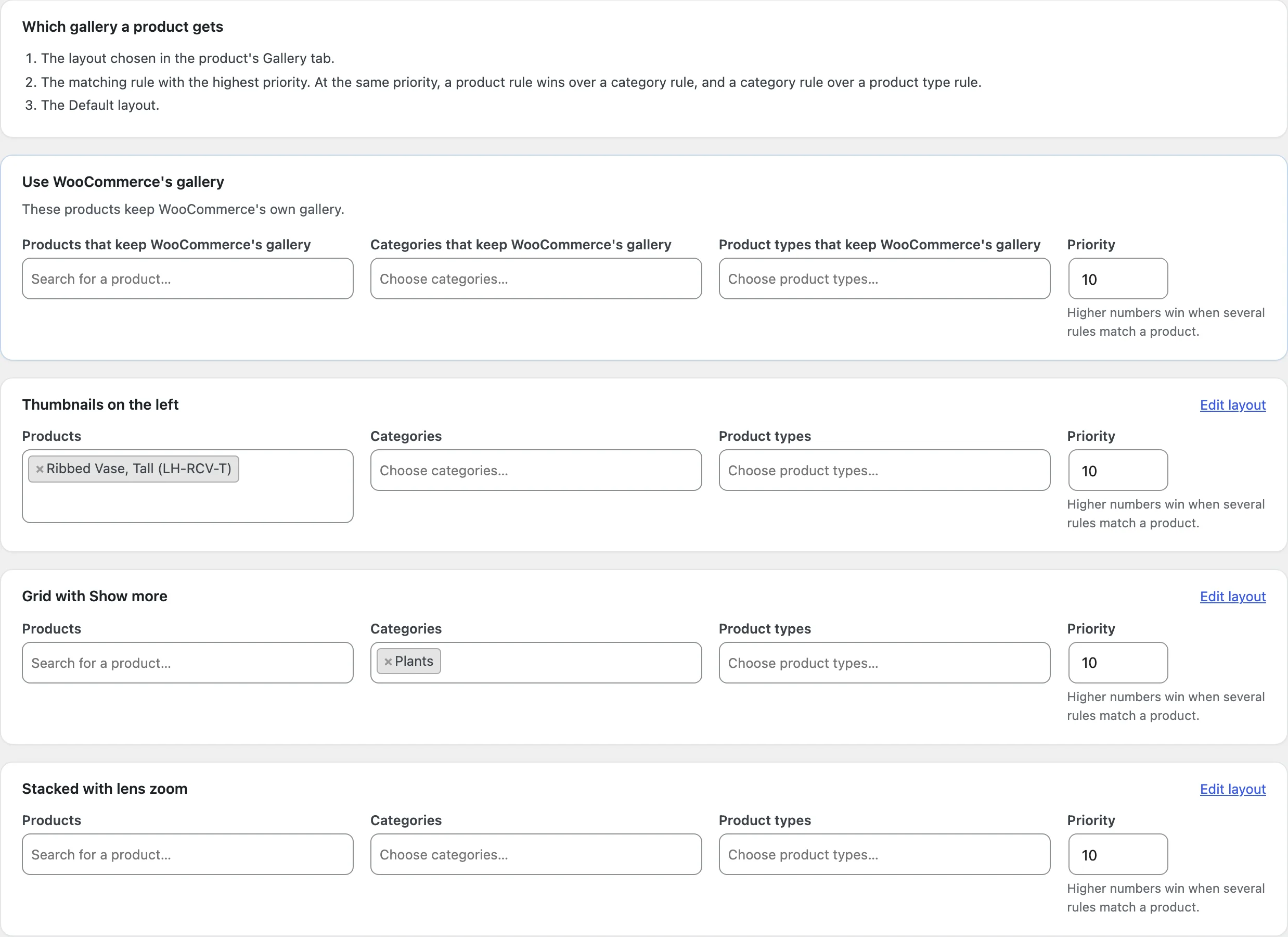
Product Gallery > Display rules decides which gallery each product gets. A product’s own choice in its Gallery tab comes first, then the matching rule with the highest Priority (0 to 100), then the Default layout. At the same priority, a product rule wins over a category rule, and a category rule over a product type rule. Each layout other than the Default has Products, Categories (subcategories included) and Product types, and the same fields are in the layout editor. Use WooCommerce’s gallery has them too: the products it matches keep WooCommerce’s own gallery and scripts.
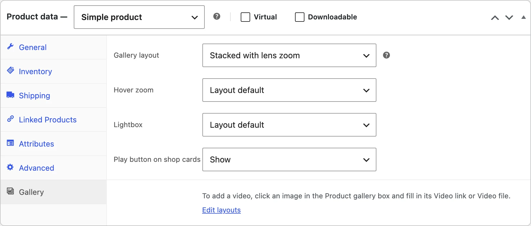
Each product has a Gallery tab in Product data. Gallery layout follows the display rules (the default), picks one of your layouts or keeps WooCommerce’s gallery for this product. Hover zoom and Lightbox follow the layout or are turned on or off for this product, and Play button on shop cards shows or hides the product’s shop-card play button while that setting is on.
Where the gallery shows
With Replace WooCommerce’s gallery automatically on (the default, in Settings > General), the gallery takes the place of WooCommerce’s on product pages. On classic themes, such as Storefront, it sits where the theme shows the product images. On block themes it replaces the Product Image Gallery and Product Gallery blocks of the single product template. It also replaces Elementor Pro’s Product Images widget and Divi 4’s Woo Images module.
Turn the setting off to show the gallery only where you place it. The Product gallery slider block shows the current product in product templates, or a product you choose, with the layout from the display rules or one you pick, and WooCommerce’s gallery blocks can be transformed into it. Elementor has a Product gallery slider widget with the same two choices, and the shortcode works anywhere else. In Bricks templates, use the shortcode in place of Bricks’ Product Gallery element.
[product_gallery_slider]shows the current product’s gallery on its product page or in a product template.[product_gallery_slider id="123"]shows the gallery of product 123;idcan also be a SKU.[product_gallery_slider id="123" layout="456"]uses layout 456 instead of the display rules.
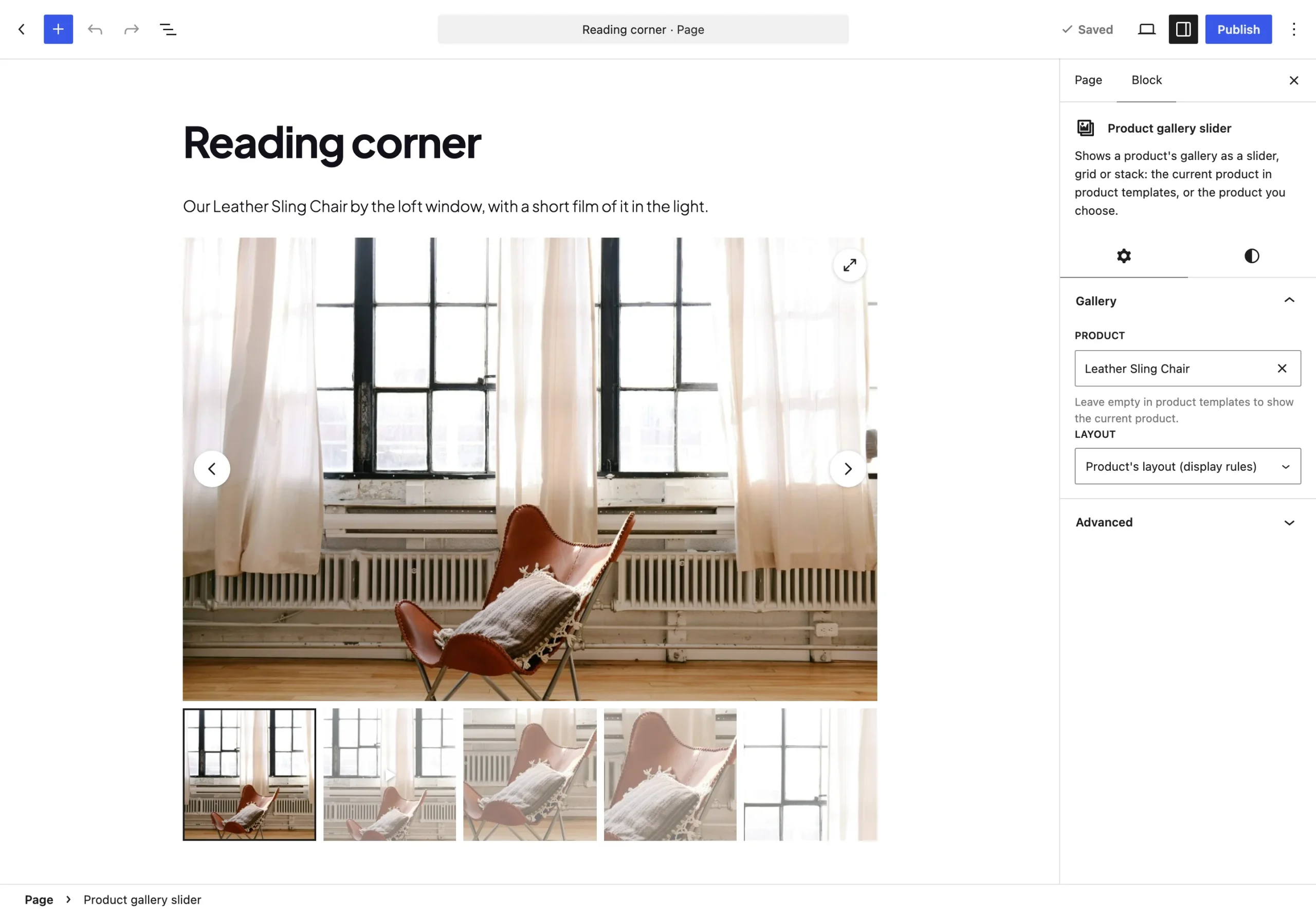
Products set to WooCommerce’s gallery show WooCommerce’s gallery in the block, the shortcode and the widget too.
Play buttons on shop cards
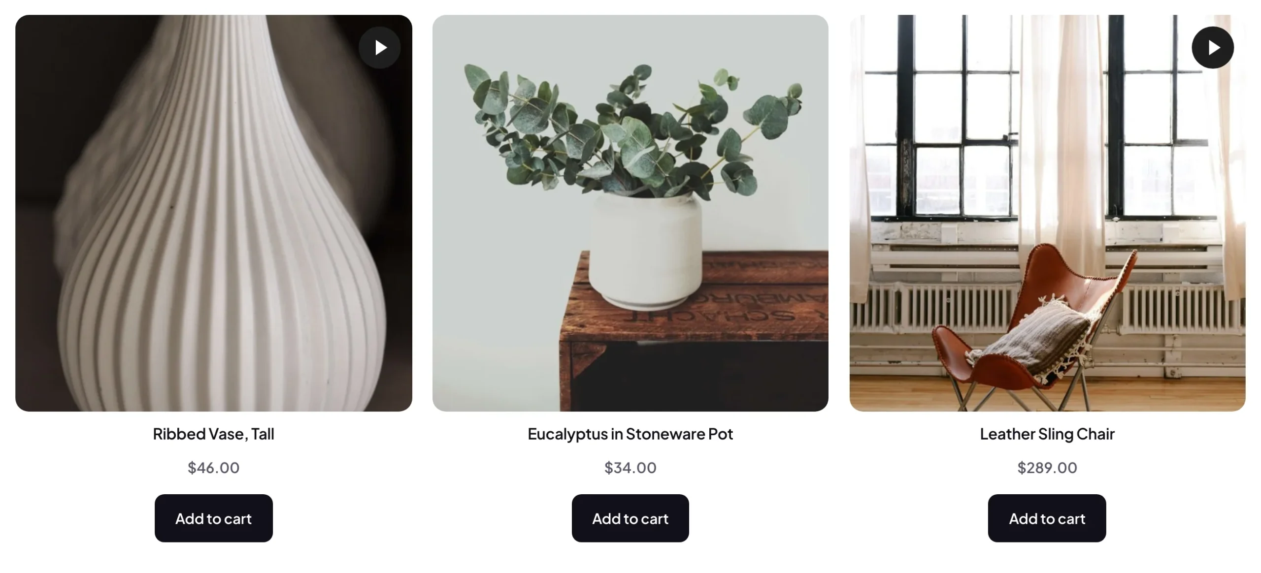
Play button on shop cards in Settings > General (off by default) adds a play button to the picture of products whose gallery has a video, on shop, category and search pages and in WooCommerce’s product blocks. It opens the product’s first gallery video in the lightbox, without leaving the page. A product’s Gallery tab can hide its button.
Speed and image sizes
The gallery uses one small script with no jQuery or slider library, and loads it and its stylesheet only on pages that show a gallery. The first image loads right away with a high priority, the other images and thumbnails load as they’re needed, and full-size images load only for zoom and the lightbox. Every image has its width and height, so the page doesn’t shift as images arrive. Gallery data is cached per product and rebuilt when the product changes.
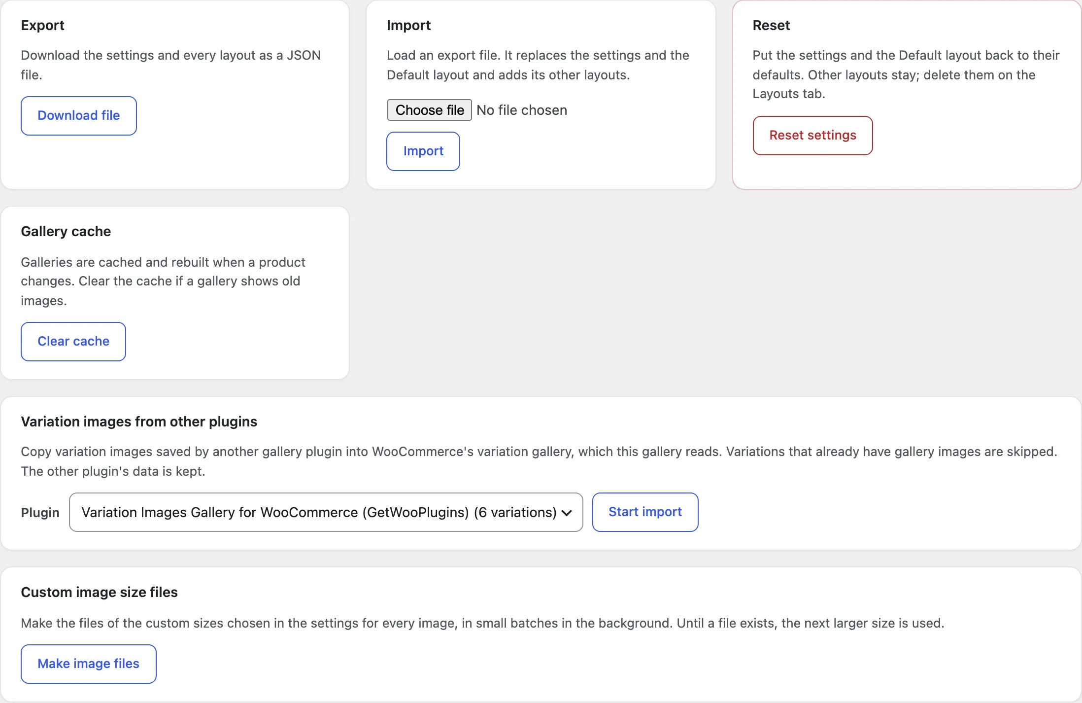
Settings > Image sizes chooses the Main image size and the Thumbnail size: WooCommerce’s sizes (the default), another registered size, the full size, or a custom size with its own width, height and crop. The files of a custom size are made in the background when you save it, and Make image files on the Tools tab runs that again; until an image has its file, the next larger size is used.
Tools, CSV and REST API
Export downloads the settings and every layout as a JSON file, and Import loads one: it replaces the settings and the Default layout and adds the other layouts. Reset puts the settings and the Default layout back to their defaults and keeps your other layouts. Clear cache rebuilds every gallery, if one shows old images.
Variation images from other plugins copies variation images saved by Variation Images Gallery for WooCommerce (GetWooPlugins or RadiusTheme), Codeixer’s Product Gallery Slider or Additional Variation Images, or Reno Product Gallery (ShapedPlugin) into WooCommerce’s variation gallery, in the background. Variations that already have gallery images are skipped, and the other plugin’s data is kept. Custom image size files shows when a custom size is chosen in the settings.
WooCommerce’s product CSV export and import have Gallery layout and Gallery videos columns. Gallery layout is a layout ID or name, or woo for WooCommerce’s gallery. Gallery videos lists image ID|link pairs separated by semicolons, such as 41|https://youtu.be/…. The REST API adds a read-only pgsp field to products and variations with the layout, zoom and lightbox choices and the image videos.
Settings
| Setting | What it does |
|---|---|
| Layout | Slider, grid, big image over a grid or stacked; thumbnail position, columns, gaps, Show More, the phone layout, widths and space below. |
| Slider | Arrows, dots, autoplay, loop, slide or fade, speed, direction, mouse drag, height and captions. |
| Thumbnails | Thumbnails shown on each device, gap, side strip width, shape, the active and other thumbnails, change on hover and a small zoom. |
| Zoom | Zoom style, zoom level, the lens, the side window, the image while zooming and zoom on phones. |
| Lightbox | Where it opens from, the icon, captions, counter, full screen, zoom, the thumbnail strip, the overlay and the animation. |
| Video | In the slide or the lightbox, the video position, muted autoplay, loop, player controls and the play icon. |
| Look | Corner radius, the accent color and the placeholder while images load. |
| Display rules | Layouts for products, categories and product types with a priority, and the products that keep WooCommerce’s gallery. |
| Settings > General | Automatic replacement, categories without hover zoom, tablet and phone widths, the Show More text and the shop-card play button. |
| Settings > Variation images | What a variation pick does, and shared images before every option is chosen. |
| Settings > Image sizes | The main image and thumbnail sizes, including custom sizes with crop. |
| Settings > Custom CSS | Your own CSS after the gallery styles. |
| Tools | Export, import and reset, the gallery cache, variation images from other plugins and custom image size files. |
For developers
| Hook | Use |
|---|---|
pgsp_is_active | Decide whether a product shows this gallery or WooCommerce’s. |
pgsp_layout_for_product | Change the layout a product uses, or return woo for WooCommerce’s gallery. |
pgsp_slides | Reorder or remove the slides of a product or a variation. |
pgsp_gallery_classes | Add classes to the gallery. |
pgsp_image_sizes_attr | Change the sizes attribute of the gallery images. |
pgsp_video_embed_url | Change a video’s player address. |
pgsp_admin_capability | Let other roles change the gallery settings (default manage_woocommerce, which shop managers have). |
pgsp_before_gallery | Runs before a gallery is drawn. |
pgsp_after_gallery | Runs after a gallery is drawn. |
To change the markup, copy files from public/templates/ to yourtheme/product-gallery-slider/: gallery.php, slide-image.php, slide-video.php, thumbnails.php and controls.php. Slides the script builds for variations don’t use theme copies. The gallery fires the events pgsp:init, pgsp:change and pgsp:play on its root element, and window.pgspGallery has init(), get() and openLightbox().
Frequently asked questions
Why does a product still show WooCommerce’s gallery?
Check that Replace WooCommerce’s gallery automatically is on in Settings > General, that the product’s Gallery tab isn’t set to WooCommerce’s gallery, and that the product, its categories and its type aren’t in Use WooCommerce’s gallery in Display rules. In page builder templates other than Elementor Pro’s and Divi’s, add the block or the shortcode (in Bricks, the shortcode).
Why doesn’t a video show?
Select the image in the media window and read the line under Video link: it says which source was found, or that the link isn’t a YouTube, Vimeo, Dailymotion or video file link. The image must be the product image, in the Product gallery or in a variation gallery.
Where do I add variation images?
On each variation, in WooCommerce’s own variation gallery (WooCommerce 11.1 or newer). To move images saved by another gallery plugin, use Product Gallery > Tools > Variation images from other plugins.
A gallery shows old images. What do I do?
Galleries are cached and rebuilt when a product changes. If one still shows old images, click Clear cache in Product Gallery > Tools.
How do I remove all data when deleting the plugin?
Add define( 'PGSP_REMOVE_ALL_DATA', true ); to wp-config.php before deleting the plugin. WooCommerce’s variation gallery images stay.
Changelog
1.0.0 · November 3, 2026
- Slider, grid, big image over a grid and stacked layouts, with thumbnails below, above, left or right.
- Hover zoom, a lightbox with zoom and a thumbnail strip, and video slides for YouTube, Vimeo, Dailymotion and video files that load nothing until play.
- Variation images from WooCommerce’s variation gallery, with three ways to show them.
- Layouts with display rules, a choice per product, presets and a live preview.
- A block, a shortcode and an Elementor widget, with WooCommerce’s gallery blocks, Elementor Pro and Divi replaced too; settings export and import, variation image import, CSV and REST fields.